
In today’s article we are going to learn how to build pretty much standard these days on the web pages and that is the alternative color mode and switching between them. This is very useful when during night you want the user to be able to NOT suffer by staring at very bright colors, and vice versa during the day it's better not having colors so dark on your page.
Continue reading to discover how to easily make a switchable dark theme for your page and how to implement a button for it.
Why Dark Mode?
Alternative mode to display web apps or ordinary sites is getting a lot of attention in recent years. Browsers have it, Google, Youtube offers dark mode, Apple added it to its iOS, even Windows has done the same in version 10.
The dark mode is mainly used as a supplemental mode to a light theme. It allows to lessen the strain on your eyes and normally it should be easy to switch on and off.
Using JavaScript and CSS
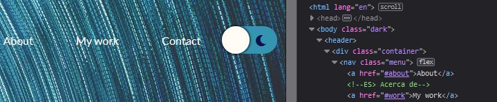
So the first thing we need is a web page where we want to add the Dark Mode. Let's open HTML code in a code editor like Visual Studio Code, or some other you like. The first thing to do is to find the place where we want to put the icon or button to activate or deactivate the mode.
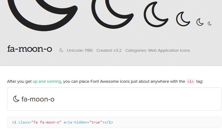
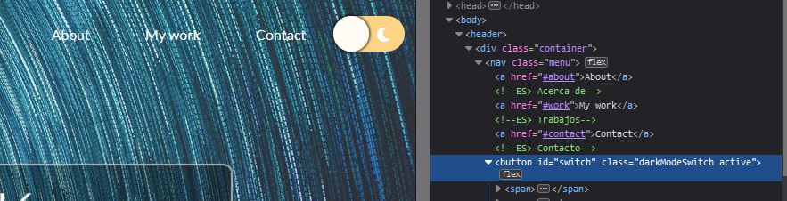
Now here we have our header and behind ‘Login’ and ‘Register’ links we will place our button, with id so we can build the functionality with JavaScript and class to be able to manipulate its style with CSS. Inside the code for the button we will place two icons, and we're going to be using FontAwesome - the icon source, where you can find most of the icons you desire.
The icons would be placed into etiquette , but first we need to link the file with icons. On our page, in the head etiquette we had already downloaded FontAwesome4 and linked to it like we can see here.
The code for the menu:

If you like to use new-ish FontAwesome 5 icons, you need to have an account.
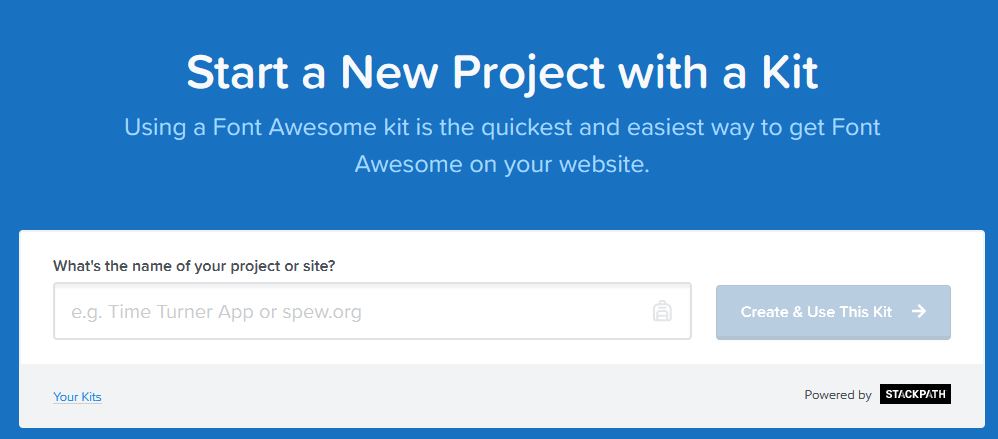
There are two ways to implement custom icons, by downloading and linking .css sheet or linking the styles to the internet. The latter we use here, we go to the FontAwesome, select ‘Start a new project with a kit’, select ‘Your Kits’, choose your kit, likely named weirdly with numbers and letters, and from there you click on the name, click on button ‘Copy Kit Code’ and that paste into your HTML code into etiquette head.
Now you can happily use the icons in your HTML code. So we find icons we like, and copy the icon HTML code.
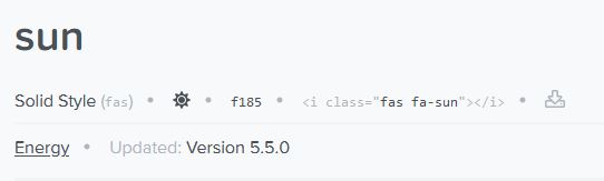
Now change the icon names or paste a HTML code previously copied according to the version of icons. Later we can easily change the style of the icons with CSS, like color and size to transform it into whatever you’d like.
We give it a style right away in a .css file. Cursor we want to be a pointer, that's when you hold the mouse over it, it will look like a mini hand and the rest like this. Position will be relative for having another element sitting on this.
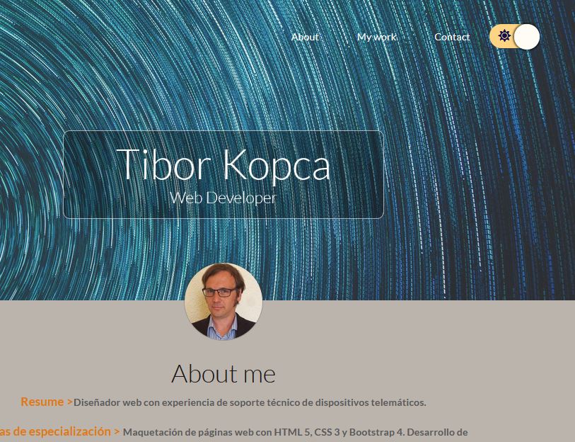
.darkModeSwitch{
    background: #3494b1;
    display:flex;
    position: relative;
    cursor: pointer;
    outline: none;
    border: none;
    border-radius: 1rem;
    align-items: center;
    justify-content: space-between;
}
With this done, we want to change the style of the icons, so they are inside
.darkModeSwitch span{
    width:30px;
    height:30px;
    line-height:30px;
    display:block;
    color:#fff;
    background: none;
}
So far we have something like this:

Now we have to do a small circle which will hide one or another option. We use the pseudoselector ‘After’, which will add anything behind the selector class. With property absolute we can play with the position of the circle in the box we made earlier - in which it is located(.darkModeSwitch) - by telling its position should be top,left,right: X px, we can define its starting position in the element. Top:0 and Left:0 would set the starting point or coordinate of the button to be top and left. If we set right:0 and left:unset, the button’s position would be on the right side. Later we will make it move left and right by alternating the position of the button. Then, content must be empty so that the other styles could work. Notice the transition, with this set to 0.5s the change of the colors won't be so drastic and sudden.
.darkModeSwitch::after{
    display:block;
    background: #fffbf5;
    width: 2.4rem;
    height: 2.4rem;
    position: absolute;
    top:0;
    left:0;
    right:unset;
    border-radius: 3rem;
    transition: all .5s ease;
    box-shadow: 0 0 2px 2px rgba(0, 0, 0, .5);
    content: "";
}

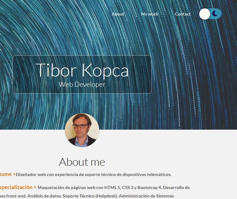
So with this we have the visual part done. Now we want also the button to change the color of its background so the light mode would be more visible when the screen is very dark. When for example this button would have another class, let's call it ‘active’ to express the state of it, the button will change colors. And furthermore, when this will happen, also we change the attributes of the pseudoelement ‘after’ so it will be on the right side by overwriting values ‘left’ to unset and ‘right’ to value 0. This functionality we’d do like this:
.darkModeSwitch.active{
  background: #fdd384;
}
.darkModeSwitch.active::after{
  left:unset;
  right:0;
}
Toggling Themes - JavaScript Part
So the rest of the work will be to actually add the class ‘active’ when we click on the button. This we’d achieve with JavaScript. Navigate yourself into the javascript file, if you don't have one, create and link it with this line in the index.html, for example right before closing etiquette of the body.